

Designing the spirit of Colorado.
As one member of a three person design studio, I played a large part in all of the brand development projects for Ironton Distillery & Crafthouse’s 2019 launch. But in my mind, it all centered around the bottles. Sold only at the RiNo crafthouse, the bottles would be on display, part of the physical space. It felt more like creating works of art than consumer packaging.


Inspired by place.
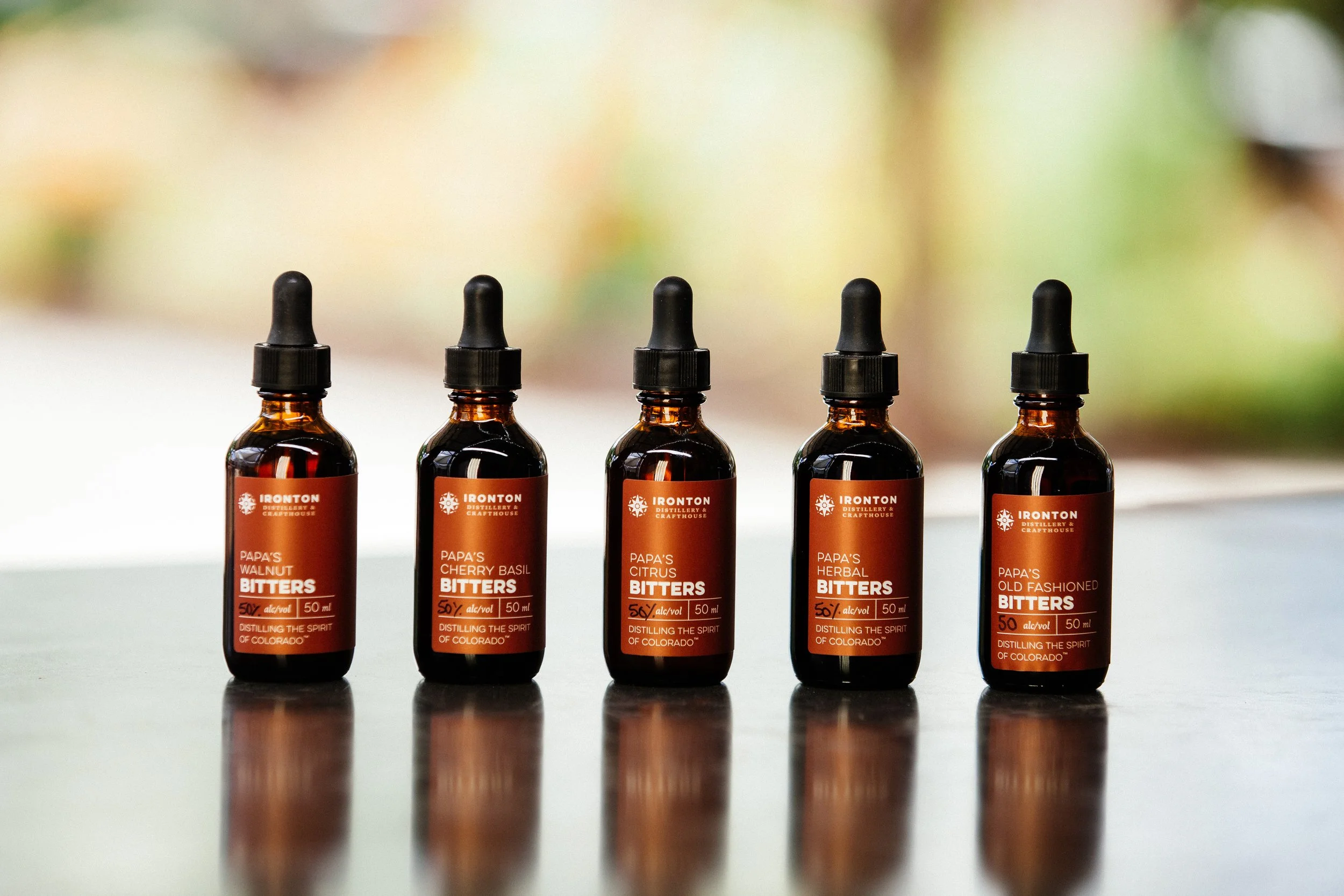
Ironton’s tagline, “Distilling the Spirit of Colorado,” was the touchstone for design decisions. Camping vibes meet urban nights. Manicured nails digging in the dirt of the on-site garden. Lost mining town mythology and a rare female distiller. A careful balance of rustic elements in minimal layouts actualized with high-end production methods.


Custom production for all.
To get custom packaging ready in time for Ironton’s opening day without breaking the bank required some smart production design and project management. Both tall and short glass bottles featured debossed logo elements and screen-printed maps. Wooden caps were stamped with the logo. Wrap-around product labels were offset printed and foil stamped on textured paper stock. Elements that would be common to a category of labels were embossed, enabling a little bit of cost reduction.


