

Write it out.
Collaborating with casting director Stuart Stone on The Actor’s Journal was both personally and professionally rewarding. Professionally, it provided lots of creative freedom in a genre that I adore. Personally, it popped up exactly when I needed a little reminder of how much fun design can be.
Start with the heart.
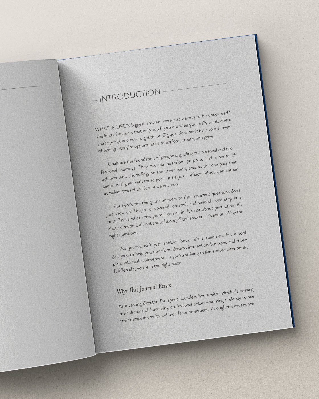
My starting point for The Actor’s Journal was designing the journal pages, since they’re the heart of the content. Many journals are filled with background illustrations and cute graphics, but that wasn’t right for the target audience. Instead, there are subtle lines for words to flow freely, with minimal copy spaciously typeset. The design elements that do exist have reasons to be there beyond decoration. Each journal entry is given a full-page spread. Since it is easier to write on the right-hand side of an open book, that page has the most space for writing.


Move on to the head.
The opening content continues the look and feel of the journal pages. Spacious typesetting, thoughtful type styles, and subtle horizontal rules keep the reader relaxed and welcomed into the content.


Cover art.
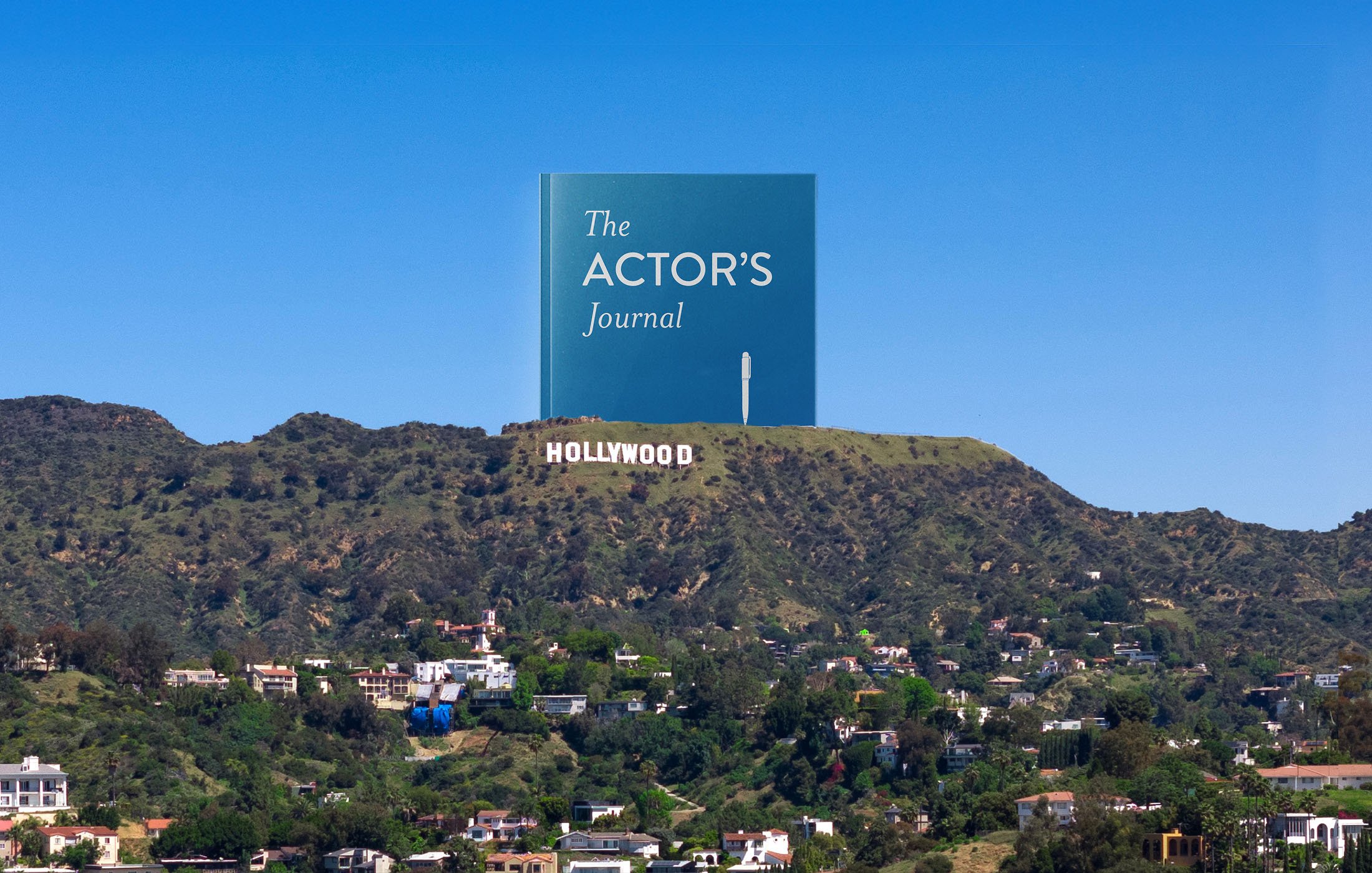
The cover art is simple but striking. The white tear in the middle is in the shape of the Hollywood hills, with the pen in place of the radio towers.
