

Handle with care.
The first edition of Leading Impact Teams was co-author Paul's seminal work, and the second edition needed to match or surpass its predecessor. I was instructed to prioritize creating a cool print version over making something easy to translate to an ebook. I needed to incorporate new company branding while keeping essential elements of the old brand.

Not too new.
The revised cover maintained the recognizable layout of the best-selling original while incorporating colors from the new Core Collaborative brand.


Not too old.
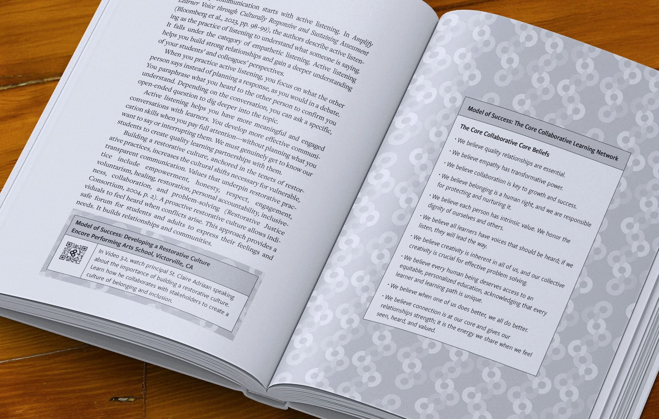
The interior design was a significant departure from the first edition. Where the first edition's layout was dense, the new layout prioritized an open feel: spacious chapter start spreads featured a pattern block derived from the Impact Teams logo, chapters always started with a full-page quote on the left page, and unapologetically spacious callouts set Mastery Moments, Reflections, and QR code tips apart from paragraphs.


Branded infographics.
All the interior images were revised to match the new Core Collaborative brand, using Goldplay typeface, brand iconography, and circular frames. Special attention was paid to make sure font sizes and line widths were consistent throughout.


