Johnson Financial Group
Branding, Business Papers, Print Collateral, Client Gifts

Objective: Rebrand a Single Family Office to communicate their values and exemplify the high-touch service they provide.
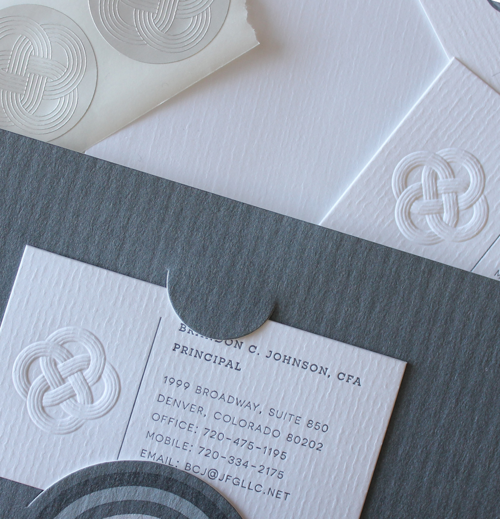
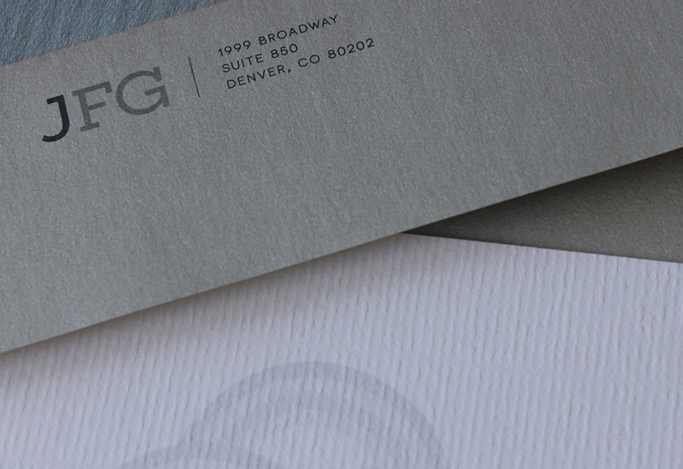
Johnson Financial Group is an integrated family office serving ultra high net worth families. JFG’s values of courage, optimism, and hard work, combined with the Johnson family history of generational wealth and philanthropy. The rebrand included a logomark featuing a Celtic knot, clean and minimal type, and a rich variety of subtle textures in the printed pieces, from the paper to the blind-embossed knot on the cards.
CLIENT: Brandon Johnson, Principal, Johnson Financial Group
ROLE: Art Direction, Lead Designer, Production Designer
WITH: Extra Strength Marketing Communication

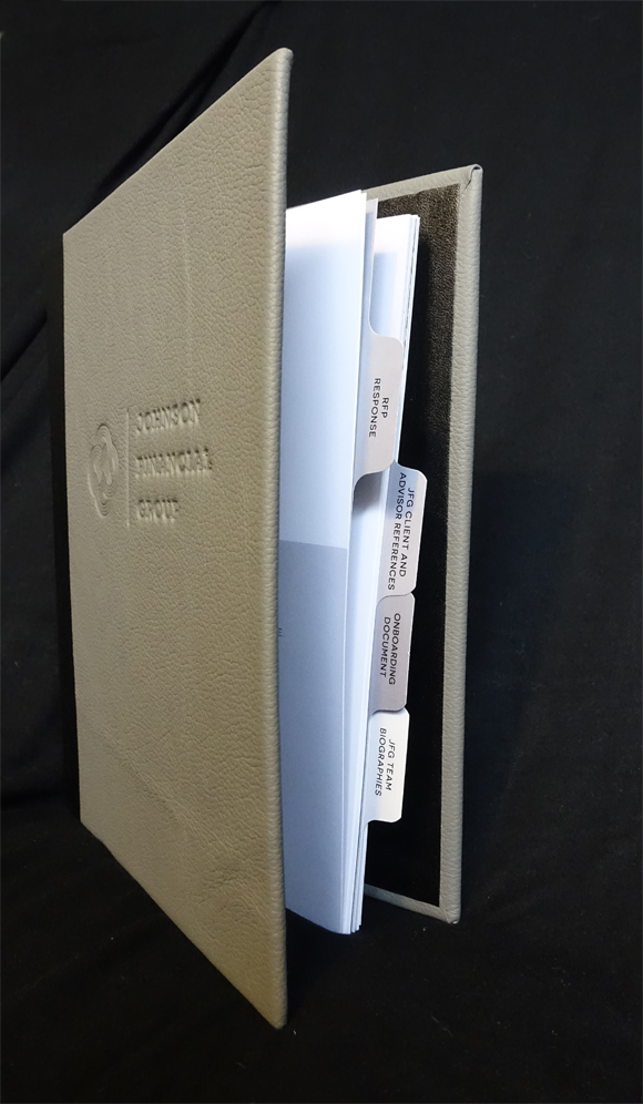
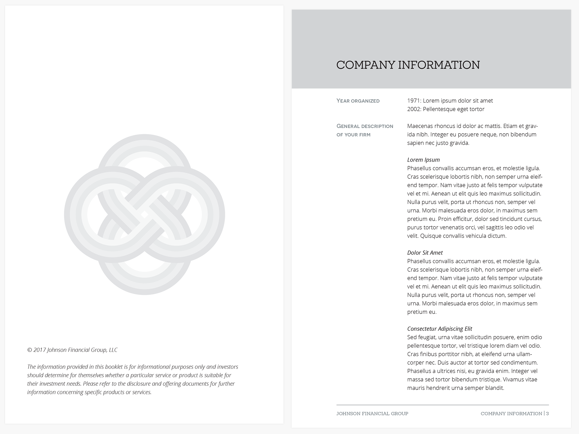
For one of JFG’s first pitches with the new brand, C.O.O. Bert Williams requested a “Goldman-Sachs” quality RFP Response. The resulting black wiro booklet with custom tabs contained in a leather cover with debossed logo was so well received, a modified version has become a staple of JFG’s client information packet.
ROLE: Lead Designer, Production Designer, Project Manager
